IOS vs Android 4.2 Jelly Beans
Jun 15, 2013, by admin
Lock Screen
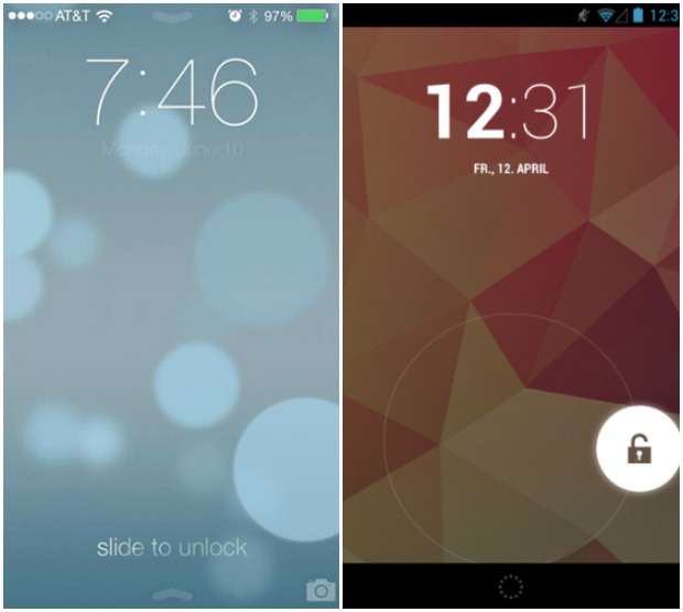 In the Lock screen the both looks like same the time at the top displays as same as big and down unlocking/Locking buttons the only different is the way of unlocking in IOS 7 we unlock via a sliding gesture and for Android it’s with a ring menu.
Home Screen :
iOS doesn’t have compatibility for interactive widgets or an App Drawer. While being organized in a grid manner, the icons of applications are a little bit bigger than those on the Android and are all the same shape. A dock bar is also available which displays a set list of applications across all your home screens. You also have the ability to create folders for applications on iOS 7 and Apple has done away with the limit on how many apps you can within a folder in this update
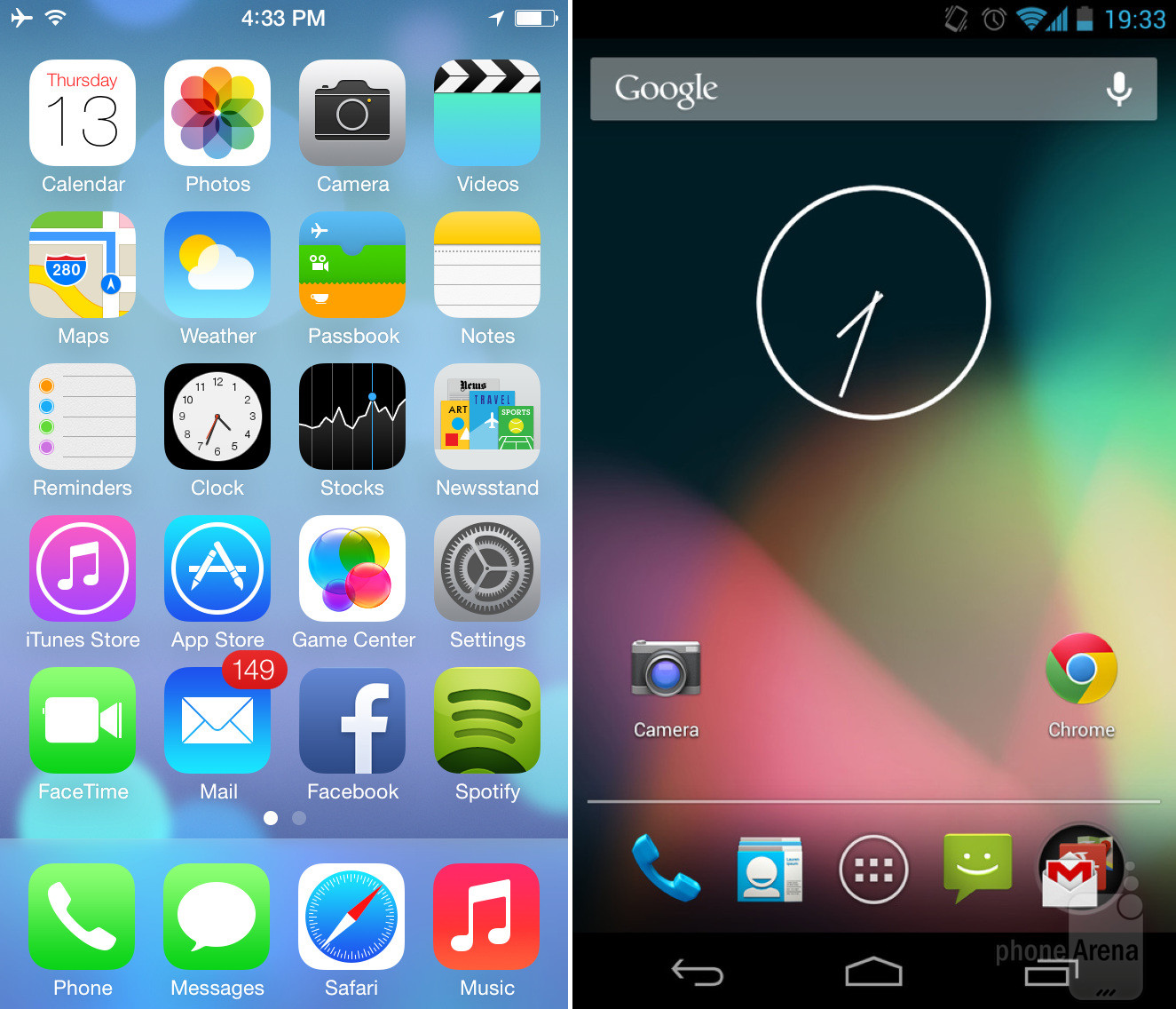
Comparing the two home screens is a little hard to do, despite the recent changes to iOS 7. On the Android side of things, you have a very interactive and dynamic screen where you can store widgets (which in themselves can be interactive), add app shortcuts and folders to your home screen. At the bottom of the dock, you have the ability to store shortcuts or folders that are always displayed, no matter which home screen you’re on.
Control Center :
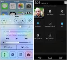 The images show the difference between the two control center but for me the android looks better than the IOS controll center
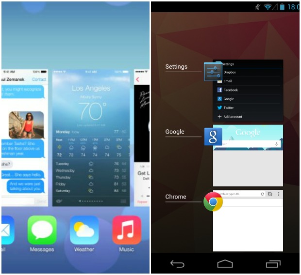
Multitasking :
 Notification :
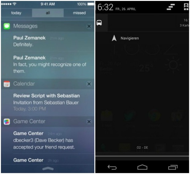
Now, from the lock screen (or home screen) you can simple drag the notification center from the top of the screen down to see events, news, notifications, etc in the new iOS. From what we can see, these are organized into three categories: Today, All, and Missed.
On Android, you access the notification center in the same manner whether you be on the lock screen or one of your home screens. However, one of the main differences is that the notifications aren’t sorted into different categories. Apart from that, the main difference lies in the choice of style and colors between the two: iOS relies more on transparent and brighter colors, where Android prefers a darker style.


