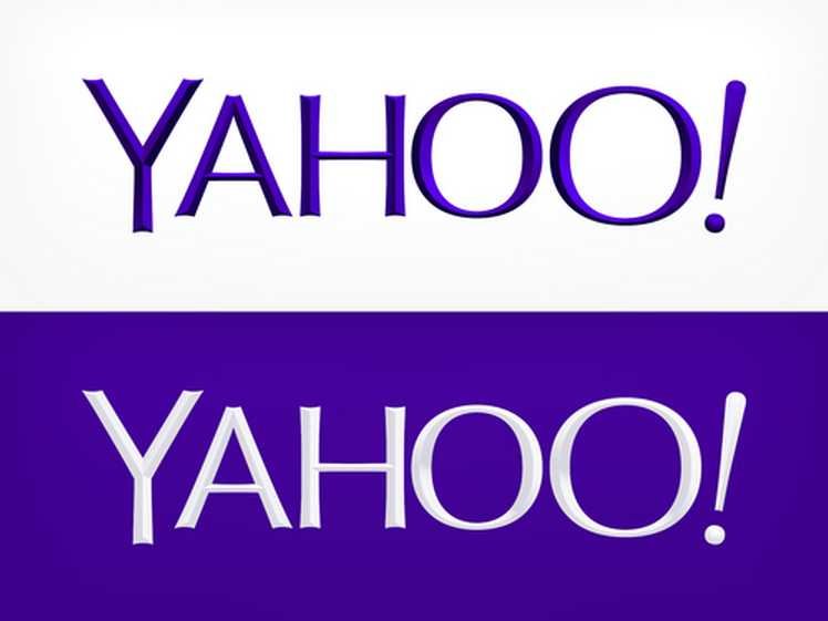
Yahoo Logo Change
Sep 06, 2013, by admin
After spending a month teasing the Internet with possible redesigns, Yahoo unveiled its new logo at midnight and it is … mostly the same. The letters are less jumbled, and Yahoo darkened its purple branding. It also kept the trademark exclamation point, as it said it would all along.

Yahoo CEO Marissa Mayer has posted a behind-the-scenes look at exactly what went into the company’s rebranding. It turns out Mayer herself played a pivotal role, working with Yahoo’s design team (and an intern) to design the new logo over the course of a single weekend. “I’m not a pro, but I know enough to be dangerous,” Mayer says of her Adobe Illustrator know-how. “We knew we wanted a logo that reflected Yahoo — whimsical, yet sophisticated,” she writes. “Modern and fresh, with a nod to our history.” Mayer goes into great detail on various decisions that led to the final design, including font weight, an intentional lack of straight lines, and an attempt to preserve the feel of Yahoo’s now former logo.
Before the design process started, company employees were polled for suggestions, with 87 percent voicing support for a revamped brand. And yes, Yahoo toyed with the idea of moving to an all-lowercase logo. “But, in the end, we felt the logo was most readable when it was all uppercase, especially on small screens,” Mayer says.
But many peoples don’t like the logo personally me to the old logo is better than new one 🙁

